Monday 4 March 2013

COPRA by Michel Fiffe


Just recently I have had a kind of 'comics mid life crisis'....I just got pissed off with the cycles of 'BIG EARTH SHATTERING EVENTS IN WHICH EVERYTHING CHANGES FOR (N)EVER!'  relaunches, and new issue #1's. Obviously there are gems to be found amongst the manure (Scott Snyder's Batman, pretty much anything Matt Fraction writes, Remender's Uncanny X-Force) but alot of what I was seeing on the racks all looked the same. 

As any comics fan with half a functioning brain will tell you 'Erm...there is more to comics than Marvel and DC, Fucko!' This is true, Image and Dark Horse are repping fully with the likes of Prophet and The Massive.....but if you dig a little deeper you can find some truly mind altering self-published shit that will blow your tiny mind!  


Like COPRA.....


HNNNNNNNNNNNGN!


COPRA is the the work of Sir Michel Fiffe (yeah thats right I just knighted this guy...thats how serious I am about this comic OK?) 

Fiffe writes, draws and self publishes this monster. We are already four issues deep and each issue delivers HARD!

yeah, that looks ouchy...


COPRA follows the eponymous band of mercenaries who now find themselves on the run following the very literal fall-out from a botched extraction job as they attempt to reassemble a fully functioning team to take on the enemies that are coming at them from all sides. Seriously these guys are NOT popular, I swear there is an entire issue of this comic where the gang have a full on John Woo shaming fire fight in an apartment with one of the team members room mates!


what's the collective noun for a group of badasses? a Van Damme of badasses? 

What I like about COPRA is the feeling that this is just the latest in a long line of missions for the team, that they are used to the feeling of cross-hairs trailing  them and conflict being only a few steps behind them at all times. The cast of this comic grows with every issue, COPRA's ranks are gradually swelling as Sonia, (the teams handler/liaison) calls in former members for the coming storm. This is where Fiffe really excels himself, the character tropes are familiar but they are delivered with such visual flair and written with such a badass, devil-may-care style that you cannot help but want to learn more about them and see them kicking ass.


like Gary here....


From the COPRA team themselves, with Castillo the grizzled mercenary and Vincent, the urban mage to Gary (the handsome, glass-shard faced fella above) and Castillo's cyborg, bounty hunter flatmates, Fiffe gives each character a unique flavour...boiling down the chunky heft of Jack Kirby, the moody noir of Frank Miller and frazzled psychedelia of Jim Steranko. 


that is some moody shit

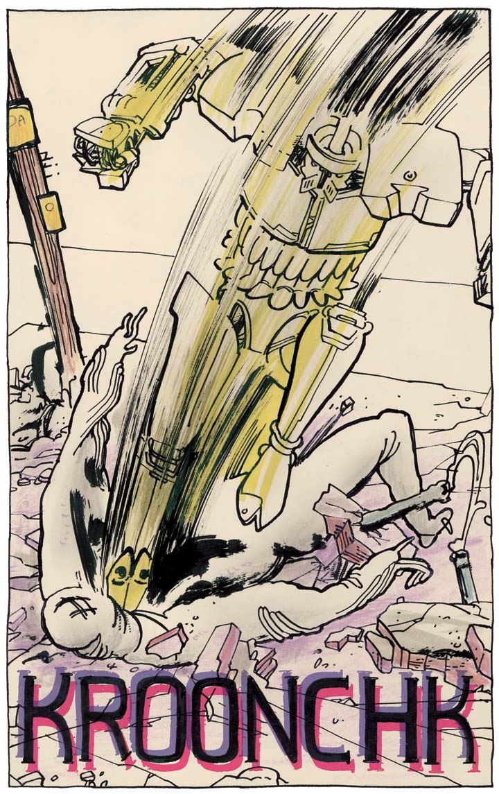
Special mention has to be given to the way in which Fiffe colours this comic, strong, Sharpie-esque pools of black jostle for position with what I can only describe as the most explosive pallette in comics...most figures and forms are awash with an almost crayon like colouring technique which lends a gentle depth. More assertive blocks of colour are deployed when necessary (laser-like weapons and big expressive sound effects) and you are never looking at boring white back grounds or wasted space....every inch of this comics is used perfectly.


mindbender


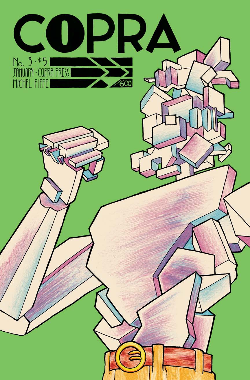
As I mentioned earlier Fiffe self-publishes this comic and it looks beautiful, wonderful, poster worthy images emblazoned on bright, often primary coloured background adorn the covers, the inner title page and actual, honest to god letters pages are both present as well as 24 glorious, uninterrupted pages of genuinely genius comics madness!


so so so so so so beautiful


In a world in which swapping creative teams around and slapping a new '#1' on the front of a comic is seen as newsworthy and exciting COPRA comes like a breath of fresh air, albeit a breath of fresh air that smells faintly of cordite...

brother knows his way around SFX..


It is truly refreshing, I have all 4 issues thus far and I cannot stop reading them!

You can find Michel Fiffe at michelfiffe.com where you can check out the skinny on COPRA and his other projects.

livid pink...


If you wanna skip straight to the part where you take my advice directly and give this guy some money you can find all four issue on Fiffe's Etsy page HERE...

Also if you are based in LONDON you can buy directly from Orbital and Nobrow.

I cannot stress how badass COPRA is....you won't regret picking it up.....

so don't be an asshole...GO AND BUY THIS COMIC


Friday 9 November 2012

Danger Club 1 - 4 by Landry Q Walker and Eric Jones


 I like Danger Club because it is violent.

Gleefully violent.

Punches are thrown and chunks of cheek are ripped off. Bright red blood sprays out across the page. Bones crunch. Heads are vaporised.


you got red on you...

The promise of graphic violence is what drew me to this comic, I'd seen a preview or a couple of unlettered panels or SOMETHING (or maybe I read something about it...) and I thought I'd check it out.

What I found delivered on the violence but it also had a great premise and an actual plot to back it all up. 

The set up is that some cosmic terror heading for Earth drew all the superheroes into space to confront it. Three months have passed and it's pretty clear they aren't coming back. Danger Club tells the story of the teen sidekicks that were left behind and what they have made of the world that is in crisis.


yeah there is a robot too!

I won't talk much about the plot as it is very clear that there is an intricate plot being woven here and you ought to experience that for yourselves. What I will say is Walker has taken great care to introduce us to these characters that he has already created a world and lore for. There is a sense that this series could be part of a larger, over arching continuity that went before. 


Each issue starts with a page rendered in a really neat Silver age style, this really adds to the feel that these characters have had adventures before, back when things were more innocent and there was less blood.

When I read Danger Club I get this weird nostalgia thing, like when I read series like Akira or Watchmen, like I know what's coming but I still get excited....I'm not saying Danger Club is predictable (it's anything but) I'm saying it hits those same beats, pulls the rug out from under you and throws you curveballs (then follows up the curveball with a tooth shattering blow to the face with a baseball bat)


allow me to explain about the glow knuckle dusters..

One of the best set pieces in Danger Club (and a great example of the above mentioned rug-pulling, 'fuck me that's awesome' moments) is when Kid Vigilante retrieves some glowing knuckle dusters from the moon in order to beat the living fuck out of Apollo, some sort of god sidekick. Just re-read that and let it sink in. Yeah...I know....FUCKING AWESOME!

Danger Club represents what comics should be about to me, action and gore collide with an perfectly paced story literally dripping with ideas and cool characters. 

What I picked up on a whim turned out to be one of my favourite comics of recent time, Image Comics pull another winner out of the bag. Between this, Prophet, Bulletproof Coffin, Manhattan Projects and Fatale Image has 2012 in the bag!

The trade of the first four issues came out last week, it's around £7 in print or £3.99 digitally.....it's fucking ace pick it up or i'll retrieve a set of glowing knuckle dusters from the moon and punch your god damn jaw off.

Wednesday 7 November 2012

BEDLAM #1 by Nick Spencer and Riley Rossmo

We've been gone a while... again. But we will always come back - I promise!

Last time we were here, I ventured into the darkness of Happy #1, and asserted that perhaps that book was in fact trying to shake us out of the darkness. I return this week to delve further into the darkness than ever before, as I look at last week's new offering from wunderkind writer Nick Spencer, Bedlam.


First, context. You may remember my profile of writer Nick Spencer from January this year where I gushed about the man's talents, prior to my meeting him at Kapow this year where I gushed all over him in person. Since then, his magnum opus Morning Glories has reached new heights of insanity and is approaching its quarter-way-through mark, still introducing mystery after mystery. Meanwhile, we patiently await the fifth and final issue of Infinite Vacation, regarded by many to be Spencer's finest work thus far; a nightmarish modernisation of Dickian ideas. In between, we've been treated to Spencer's solid scripting of Robert Kirkman's Thief of Thieves, which despite its flaws was snappy and involving in terms of all-important dialogue. Riley Rossmo, meanwhile, has been one of my favourite artists of the last couple of years, and you may also remember me heaping praise upon the man for his work on Green Wake and Debris quite recently.

Bedlam, then, is the first meeting of these two talents, and does not disappoint. The writing is dense and confident, the art never more suited to the subject matter. Bravely packing a first issue with 50+ pages, Spencer and Rossmo are carving a work of admirable density, not only in terms of plot but thematically too.

There are many sadistic, psychologically damaged villains in comics, whether their psychopathy is overtly discussed or merely implied - although post-Watchmen and post-Miller, we all know that our heroes have been as damaged as our villains. This book takes the deranged psychopath motif and poses the simple question of what happens to such a character after he's stopped being the villain. As the tagline on the cover reads, 'Is evil just something you are, or something you do?' Now upon first reading, I found that tagline kind of trite - maybe it could be put better - but anyhow, maybe we need to just think about its implications. It is, after all, the theme of the book.

Madder Red is our psychopath, straight out of the Batman Nolanverse's deepest unlexplored recesses of nihlistic violence and murder. We're introduced to him in a sequence set 10 years previous, as he performs unthinkable acts. Rossmo delivers in spades with these flashback sequences, a nightmare in black, red and white. Oh yeah, and did I mention Madder Red is absolutely fucking terrifying?


We flip between Madder Red's 'heyday' and the present, where our other protagonist. Fillmore Press, goes about his daily business... the awesome hook is of course that Fillmore Press is Madder Red, ten years older and basically a different guy. The stage is set for an examination of what has led this character here - and the possibilities are endless. Having been drawn into believing the character as one entity in the flashback scenes, we're then presented with a character who is an opposite, a complete Other. Not frightening in himself, but disturbing in our knowledge that he is in fact the same person who is performing the unspeakable acts we see as we turn the page. Fillmore Press is more elusive, inviting us to feel ambivalent about him as he remains unassuming and, for want of a better word, 'normal', the only clue to his previous misdeeds being his skewed, masked version of himself staring back from his bathroom mirror.

Spencer has affirmed himself as a writer who is going to ask big questions with his work. With every limited series he gives to Image he not only dazzles creatively but also reassures long term readers of his work that he's got a plan... with Morning Glories becoming more of a headfuck each month it's almost as if he's reassuring us with layered and beautiful work like this that he's got a plan. And maybe, so does Madder Red?


Wednesday 3 October 2012

DECADENCE COMICS: Pyramid Scheme, Neptune's Fungi and Adamao by Lando and Stathis Tsemberlidis

So, I was checking out Brandon Graham's blog at the end of last week and he mentioned a bunch of releases by the London based comic collective DECADENCE. He praised their 'Moebius/Otomo' vibe and included a few pictures of the latest publication, Pyramid Scheme by Lando.

it just screamed 'BUY ME', I swear...

The words in combination 'Moebius/Otomo' had me drooling like Palov's Dog so I went to their site and bought it. Whilst I was there I picked a couple of other mini-comics by the splendidly named Stathis Tsemberlidis which also exhibited similar Moebiusisms. 


The comics arrived and the first thing that struck me was the paper stock. The beautiful, off white, fibrous paper lent a real organic and tactile quality to the work. The simple, almost uniform design of the covers (primarily Neptune's Fungi and Adamao) was also immediately striking.


Neptune's Fungi involves a one man submersible descending into to the sea and discovering some mind-bending, hallucinatory transformation occurring in the salty depths. It a horror comic at its core I think, visceral without resorting to splashes and swathes of red. In fact the only colour that is used here is black, there is minimal shading and masses and masses of tiny wrinkled, detailed lines. Its mesmerising stuff that borders on the grotesque. There is a Lovecraftian eeriness to Neptune's Fungi that I've rarely seen done this well. It's so understated and meditative.


FINISH HIM!! ...sorry


Adamao is a much more psychedelic beast. Psychedelia via the grisly body-horror of David Cronenberg, mind you. It starts with five floating brains, moves to a brutal fight by a bunch of what I guess technically must homunculus of some sort and ends with the victor flying to assume the throne in some sort of pantheon of animal headed gods. It really feels like reading a hypercondensed, visceral version of Jodorowsky's The Incal. The lines on the floating, sorta gem thing are pure Moebius. I know I keep making this comparison but Tsemberidis' pencils and awareness of scale is so god damn good there really isn't any other comparison to make....it's that good.


breathtaking stuff...

Pyramid Scheme is a collection of four short strips by Lando. Where as Neptune's Fungi and Adamao have a kinda bacterial body horror vibe the stories in Pyramid Scheme are of a more dystopian world/post-apocalypic stripe. 'Last Drink' in particular with its tale of a man and what would appear to be the last, delicious bit of water on the planet. 

mmmmm delicious shading...

Lando works with a sparser line than Tsemberlidis, you can see it in the delicate swoop of the clouds and dust in the picture above. Where Tsemberlidis uses lots of closely grouped wiggly lines to show texture and mass Lando uses a really simple but beautifully executed grey and black dot shading technique that really does evoke a heavy Otomo vibe, especially above.

The final story in the book is Pyramid Scheme itself, a trippy tale of life for three people on some sort of Greek-M C Escher-floating paradox. Things melt and turn into crystal and fall to the earth. It's spellbinding stuff it really is, you can feel the sharpness of the crystalline fragments floating around and the thick tar-like white liquid that floods everything.

this is upside down....sorry, i suck at the internet, ok?!


Alll three of the comics mentioned above are available at decadencecomics.com and do not cost very much at all. It's great to read something from our own shores that is independently made and of exceedingly high quality, surely it's worth a shot? or would you rather read Green Lantern all day long?


Saturday 29 September 2012

Aaaaaand we're back! Round-up post by Andrew

So I'm back! Props to Mark for some sexy, sexy articles in the last week.

What I have been up to (comics wise, obviously) in the last month I hear you shriek!

Well, I'll tell you...


mother fucker can Paul Pope draw...

I was lucky enough to get my hands on all four issues of THB6 by Paul Pope. These four comics are just so totally perfect in every possible way. They are all currently out of print and cost, like, £20 each on Amazon (luckily, a friend of mine was kind enough to lend them to me) So kinda pointless that I'm talking about them really but we'll press on.

THB6 is a sci-fi tale set on Mars. We follow HR Watson, teenaged girl and THB her fucking awesome, big, red robot (or Mek as THB would have it) 


see, told you....fucking awesome!


THB6 is the second arc of Pope's THB saga. Having never seen any of the other arcs I don't know if this is a continuation of the story or if it branched away from the initial arcs. Ijust jumped into the story and got lost in the dirty streets of the cities Pope populates Mars with.


Pope is from New York....go figure..

HR's father is a powerful industrialist and the evil, bug faced bad guys are hunting her down to try and fuck with her daddy's head. HR has her trusty Mek, THB, by her side and a gang of young, street urchins and bohemians. It feels like New York on Mars...There is a weird Downtown 81 via Kurt Vonnegut sci-fi vibe doing on through out all four issues. You are thrown right into the action, the bug-eye guys show up and HR, THB and their buddies are scattered, The fight scenes are beautifully illustrated.


so fucking kinetic!

Pope's art is just gorgeous through out, deep inky blacks and stark, eye popping whites jostle for position on the page, like each line and brush stroke is vying for your attention.


Pope balances the hard sci-fi elements and the emotional weight of HR basically being a teenage fugitive perfectly. THB6 is pure visual poetry, even the word balloons are beautiful.  


Next up, The Victories by Michael Avon Oeming.

I picked up the first 2 issues of this mini-series a couple of weeks back. Oeming's work in Powers is amazing, it has a real Bruce Tim vibe and his use of negative space and inky, deep black tones is almost Mignola-esque. 

The Victories focusses on the titular superhero team, Faustus is a wise cracking, slightly Batman-esque protangonist. We meet him in the first issue fucking up a werewolf guy who has just decapitated the mayor!

little tinker...


Faustus and the other Victories later go and bust up a drugs den were they are manufacturing a drug that makes you fly, Oeming illustrates these scene really nicely, the bodies have this weightless, eerie look.

nice
Two issues in The Victories is a fun gritty romp, the plot doesn't really get moving until the end of the second issue but it is really pretty to look and and nice and violent and sweary!


Friday 28 September 2012

HAPPY! #1 by Grant Morrison and Darick Robertson


FUCK. FUCK FUCK FUCK.

The word bounces of almost every panel of the opening to Grant Morrison's first book for Image Comics more than any other, and immediately, you have to start asking yourself why. It's this stylistic virtuosity that punctuates all of Morrison's work; everything he does, he does for a reason. You just have to work out what it is.

And so, in this bleak and ultra-sweary landscape, we meet ex-cop Nick Sax, who may or may not be a nice guy underneath (let's find out over the next 4 issues), a grizzled and compromised individual who winds up being wounded in a hit-gone wrong.

Don't worry, not THAT wounded.

The initial premise of the book as laid out above aligns it with other ultraviolent, ultra-explicit and you guessed it ultra-scary comics out there. But as I said above, this is Morrison, and you have to expect more. Perhaps despite the ridiculous saturation of colourful language in the first few pages, it doesn't become apparent that this is entirely satirical until we meet the book's hero... Happy.

 
Happy is a talking, flying, imaginary blue horse who is about to help Nick out of a tight spot. And that's about as far as we get in this superbly-paced first issue, which starts as one thing and ends as completely another. 

Many years ago, in 1988, when Morrison wrote Animal Man #5, he treated the world to a story which combined his fledgling superhero project with a striking metatextual twist in 'The Coyote Gospel'. 

http://marswillsendnomore.files.wordpress.com/2011/11/animal-man-5-coyote-gospel-006.jpg 
 'The Coyote Gospel' is absolutely insane, but jaw-droppingly brilliant. In the story, Crafty, a cartoon character not-so-loosely based on Wile E Coyote, assures the peace of his plane of existence with his creator (writer) by being sent to the world of comic books. Animal Man Buddy Baker is absent for most of the issue, with the story instead focusing on Crafty being perpetually hunted by a truck driver in a violent and disturbing manner which amplifies the sadistic chase of the cartoon world to a palpable, tragic and very engaging level. 


Crafty and Happy draw inevitable parallels and comparisons, both being out of place in their narrative. Crafty's true form is a Looney Tunes character pulled into the world of a more realistic anatomy, and Happy, too, is a cutesy creation appearing in the most gritty of situations.

But perhaps we could posit that while the two stories may have similar preoccupations, they are products of different times and have different points to make. Crafty's creator is sadistic, joyful in the horror that he forces the coyote to experience in order to ensure the safety of his world. Happy, however, has a writer who is turning the microscope the other way, and wants to dissect the reader's psyche instead. Is ultraviolence what you really want, or do you want a cute fucking blue horse? Does violence and swearing really make you Happy?

We'll learn more as the story progresses, but Morrison recently described Happy as "Sin City meets It's A Wonderful Life" and having read the first issue it seems a likely trajectory that our blue friend will show us that we need something lighter than the world Sax comes from...